


Monthly Digest: September 2024
Insights and references

Hey everyone, trying something new here: a monthly digest where I share a bit about the process and inspiration behind some of my photo essays.
While I enjoy publishing photos with no words or context, letting the work speak for itself, I do have plenty of words and context to share, and this seems like a pretty good place to do so.
My intent is to write about a past photo essay and why I made the choices I made. The initial ideas, the lines of thinking, the references I had in mind, that sort of thing. Maybe I’ll tell you how things went wrong (BTS drama) or how an essay came together at the final hour. Who knows! I hope these installments provide a more holistic view of how I approach and collect the ideas, experiments, and studies that make up Observations.
On Impressions
I got a new phone last summer. I was reluctant to give up my iPhone 8, which I was (and still am) convinced had a better camera than any other iPhone before or since. I had heard that Apple’s new iOS system applied automatic processing to iPhone images, rendering photos that look extremely digital, over-sharpened, gross, etc. When I looked this up, there didn’t seem to be any solutions or workarounds. I mostly found Reddit threads of people lamenting about how bad we all look in iPhone photos now. Fair enough!
I knew I shouldn’t complain too much, after all, I could always carry a regular camera around. This is simply how our ridiculously convenient portable-computers work now, such is life. I began to play with the conditions of this new iPhone and quickly noticed a weird little bug. When I used the 3x zoom setting and attempted to adjust the exposure, the camera would lose focus and the image would blur entirely. This was annoying, but also interesting, and I really liked the result.
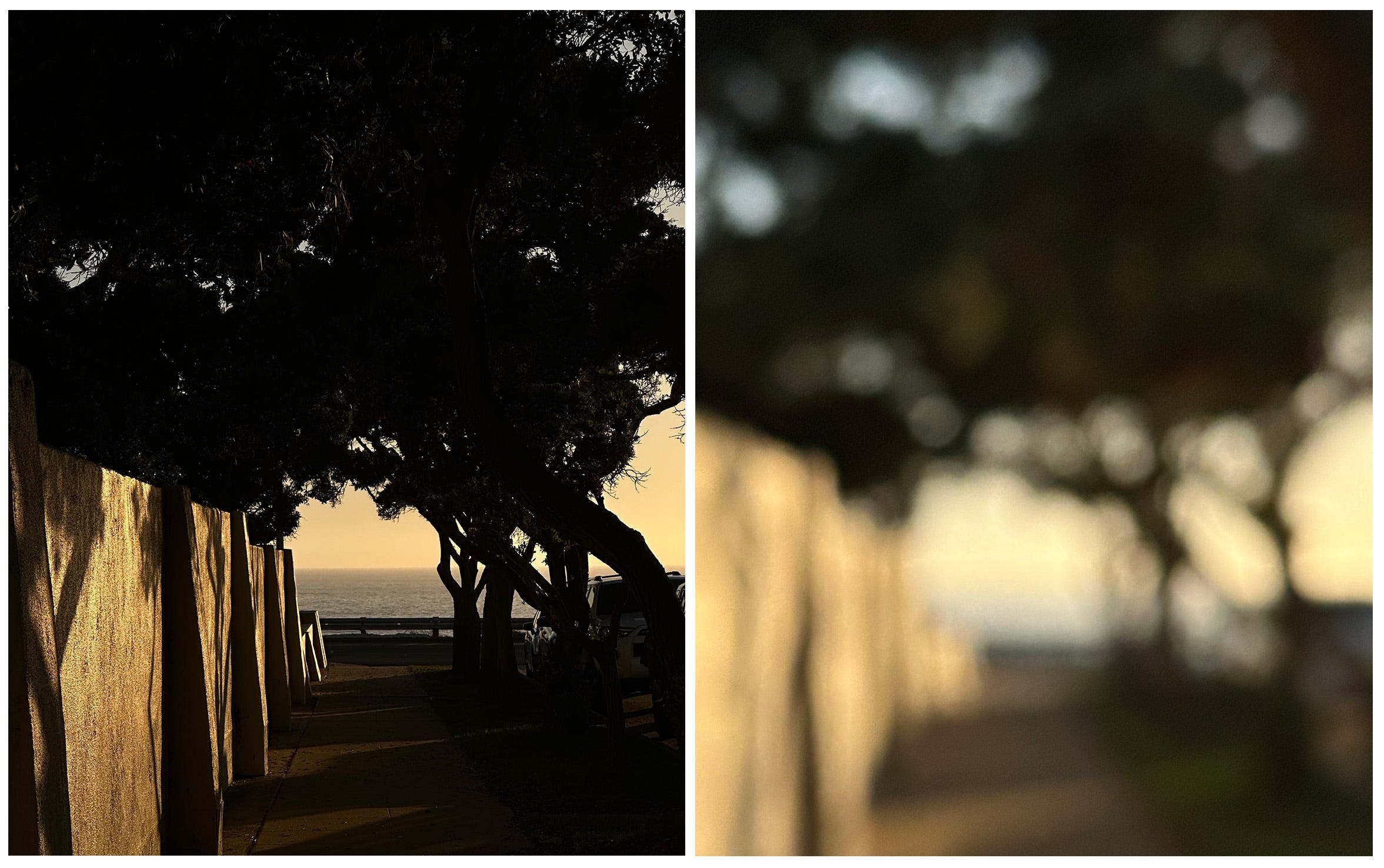
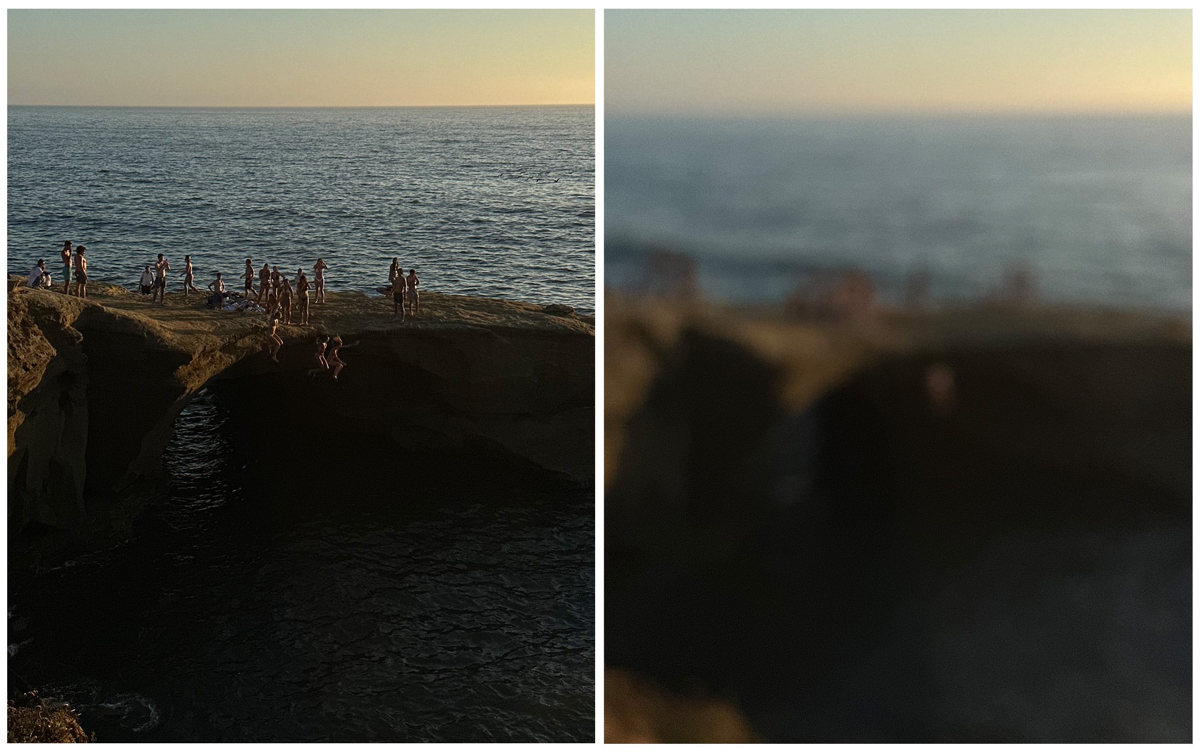
I absolutely love blur and play with it often (see #71. Abstractions, #26. Background players, #59. Holiday blur). I love the emphasis it places on form, color, and composition.
With plenty of photos, what you see is what you get. But there’s a painterly quality to an out-of-focus image, and the delay in subject recognition allows for a sense of mystery that is really exciting to me. On a screen, these photos don’t look like photos at all.
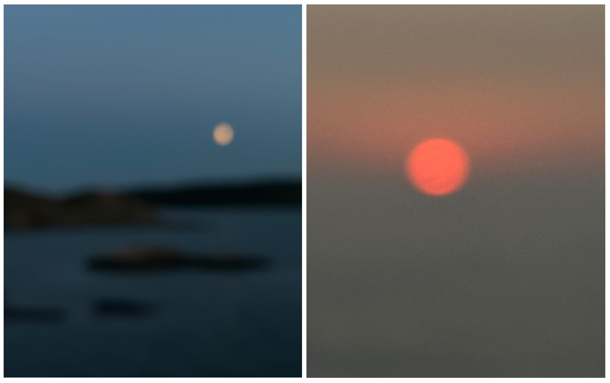
One of the artists I think about most often is Georgia O’Keeffe. Many of her early watercolors are abstract, but the pieces are grounded by the inclusion of natural elements.
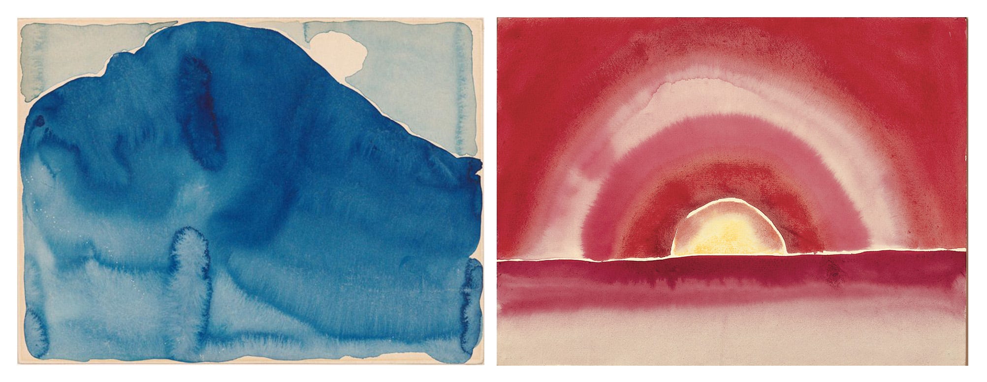
I didn’t make the connection at the time, but it seems this approach informed some of the images that I made for Impressions. Water, trees, the moon, the sun…we know this stuff. It was fun to complement those elements with varying levels of abstraction: making some objects very recognizable, and others less so, hopefully inviting some inquisition from the viewer.
The idea for Impressions took hold when I noticed the camera bug and collected some of the photos I took on accident (probably 3-4 within the final selection). I then shot the rest of the images over the course of a few weeks. I knew I wanted this study to be my 100th essay. I don’t know why, it just felt right. Funnily enough, these photos ended up being the exact opposite of the extremely digital, over-sharpened, gross iPhone imagery I was worried about.

Great insights! Your photos are wonderful and it's really interesting to get a peak behind the scenes. I'm looking forward to future installments.